form layouts in powerapps canvas apps
power platform ponderingadded 20th May 2023
Since I’ve recently started creating applications in PowerApps, I’ve found it quite confusing how the layouts within PowerApp form controls work. Setting it to snap to columns seems to be fine, right up until a scrollbar appears or something gets resized and the layout completely changes.
There is some documentation available but I thought I would do some experimentation as well to try and understand it.
https://learn.microsoft.com/en-us/power-apps/maker/canvas-apps/working-with-form-layout
It also doesn’t help that in PowerApps what is shown in the properties pane is sometimes the set value and sometimes a calculated value.
In this example the width of the card has been set by the app editor to 300, which is what will show in the advanced tab or in the formula bar, but because of WidthFit expansion and other layout settings, the card is displayed with a width of 600 in the app, and that is what the properties tab shows.
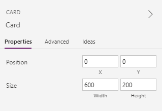
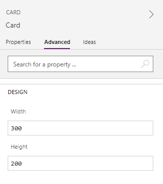
With properties that are formulas there’s an indicator that some calculation is being applied but with just a set number like widths, it can be hard to tell.
X & Y properties
At it’s simplest,
- The X property represents the order of the card within a row.
- The Y property represents which row the card is in.
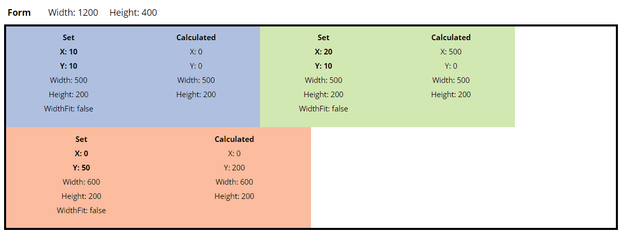
In this example we have two cards in the first row with Y=0, with the first card having X=0 and the second card having X=1. The last card is in the second row with Y=1.
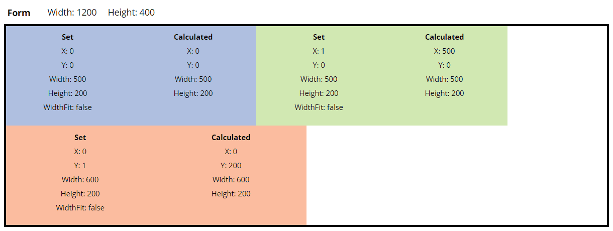
It looks like it is based on the order of the values rather than the exact value. So even if you skip a number, it doesn’t leave a gap.
In this example, even though the first card has X=10 and the second card has X=20, the second card is still placed right after the first card in that row.
Widths
For the below, setting Snap to Columns doesn’t seem to matter. It seems to be used as an easy way of setting width values to align nicely, but doesn’t change the behaviour of how the cards and widths work.
When WidthFit is off
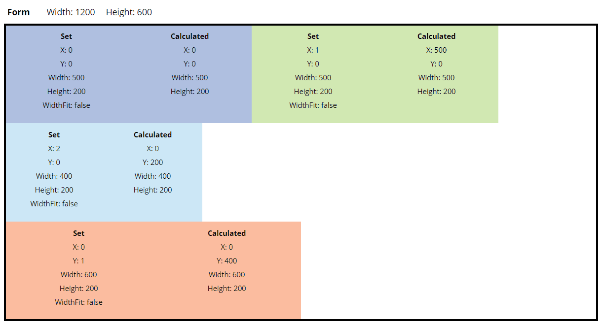
With WidthFit off, then the set width represents the width that is shown.
If the total width in a row is greater than the width, then it wraps around. When that happens, it pushes down any rows below it.
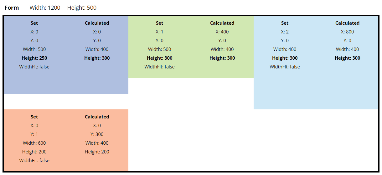
In this example the third card (light blue) has Y=0 so it should be in the first row but because the width of the first three cards (500+500+400) is greater than the width of the form, the third card wraps and creates a new row. The fourth card (orange) should be in the second row (Y=1), but because the row above wrapped it ends up in the third row.
When WidthFit is on
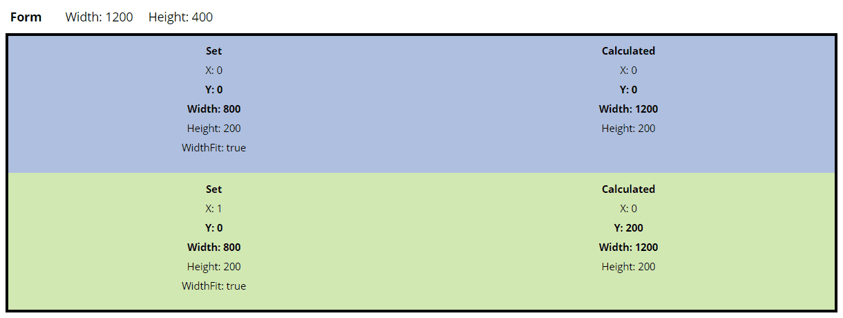
Cards with Widthfit On tries to expand to fill the remaining space.
In this example both cards have their width set to 300. This gives a combined width which is less than the width of the row. The cards then expand to a displayed width of 600 in order to fill the row.

With this expanding behaviour, the width value that is set effectively represents the minimum width of a card.
In this example both cards now have their width set to 800. This gives a combined width greater than the width of the row. As the set width is the minimum width, the cards can expand but not contract, and so the second card wraps to the next row.
You will see it still has the expanding behaviour after it wraps.
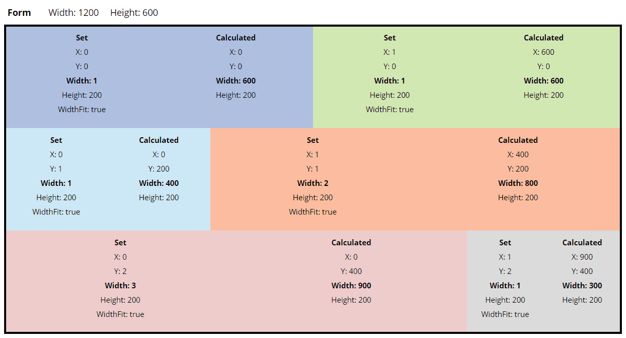
What’s interesting about the expanding behaviour of WidthFit cards is that it expands based on the ratio of the set widths.
For example, if the set widths are equal, then the cards expand equally. If we have one card with width 1 and another card with width 2, then the first card will fill 1/3 of the available space and the other card will fill 2/3 of the available space.
Mixed settings
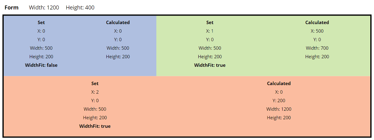
It’s also possible to combine cards with and without WidthFit. The cards with WidthFit will expand, and cards will wrap as expected.

Responsive card layout
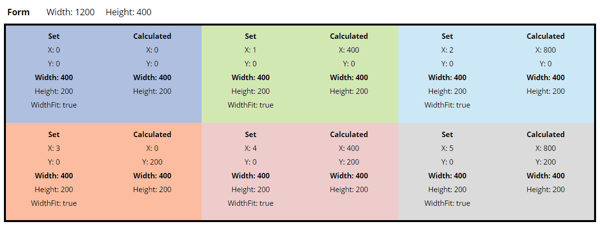
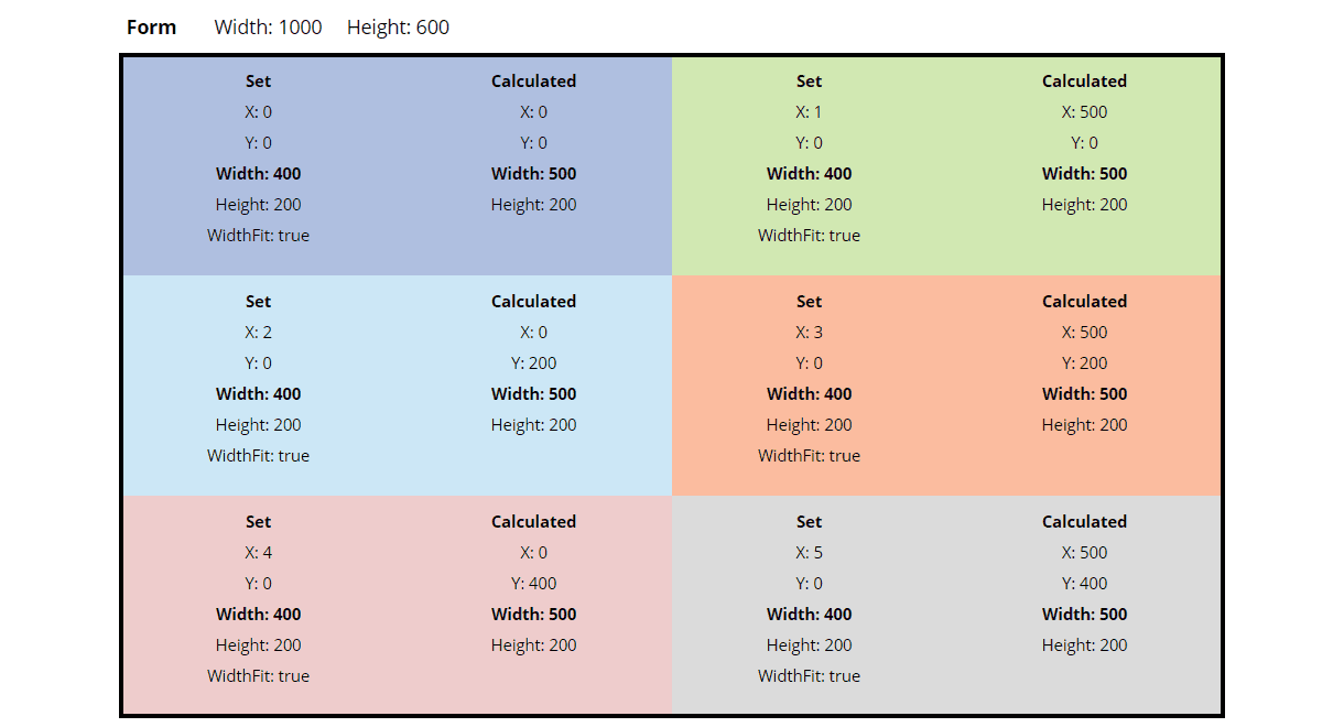
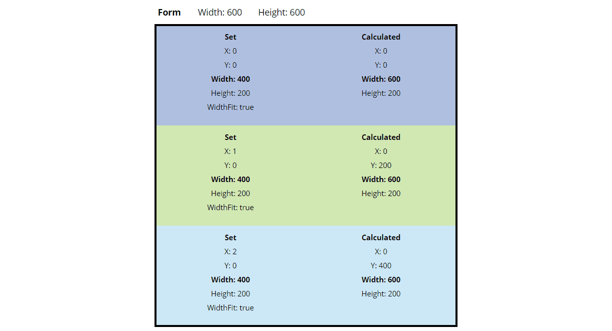
With the wrapping behaviour of cards, we can create a responsibe layout by putting all cards into the first row (y=0). By playing around with the widths, the cards will wrap at certain form widths into multiple rows as needed and form a responsive design.
Height
The height of a row expands to the max height of its children.
