creating a blog with gatsby
gatsby blogging: part 1added 28th Apr 2023
History and beginning
This is actually the third time I’ve attempted to create a blog in this fashion.
The first time I tried one of the available blog templates on the Gatsby site, but as someone new to Gatsby it was difficult to understand what all the various components within it were. That’s what I find with these templates is that it gets you up and running quickly but when it comes to understanding the concepts and knowing how to create something, it’s always good to start from the basics.
The second time I got further, to actually building out a blog with the basic features of posts, categories, and navigation. Of course, as is quite common with learning a new tool, the early attempts are a bit messy and often end up in a state where if I want to build it out further, then it’s easier to restart and set it up in a better state using what I’ve learned.
Hopefully third time does turn out to be the charm and provides something I can build on into the future.
Getting started with Gatsby
For this blog I wanted a static site generator as something that is quick, easy, and highly flexible, especially compared to tools like Wordpress. I had previously used Hugo but found I’ve been recently working with React so Gatsby seemed like a good fit.
First we need to download the Gatsby CLI and use it to initiate a new project.
npm install -g gatsby-cli
gatsby new wildquokka.com
Then we can start the development server to see the very basic template that has been setup by the initialisation.
cd wildquokka.com
gatsby develop
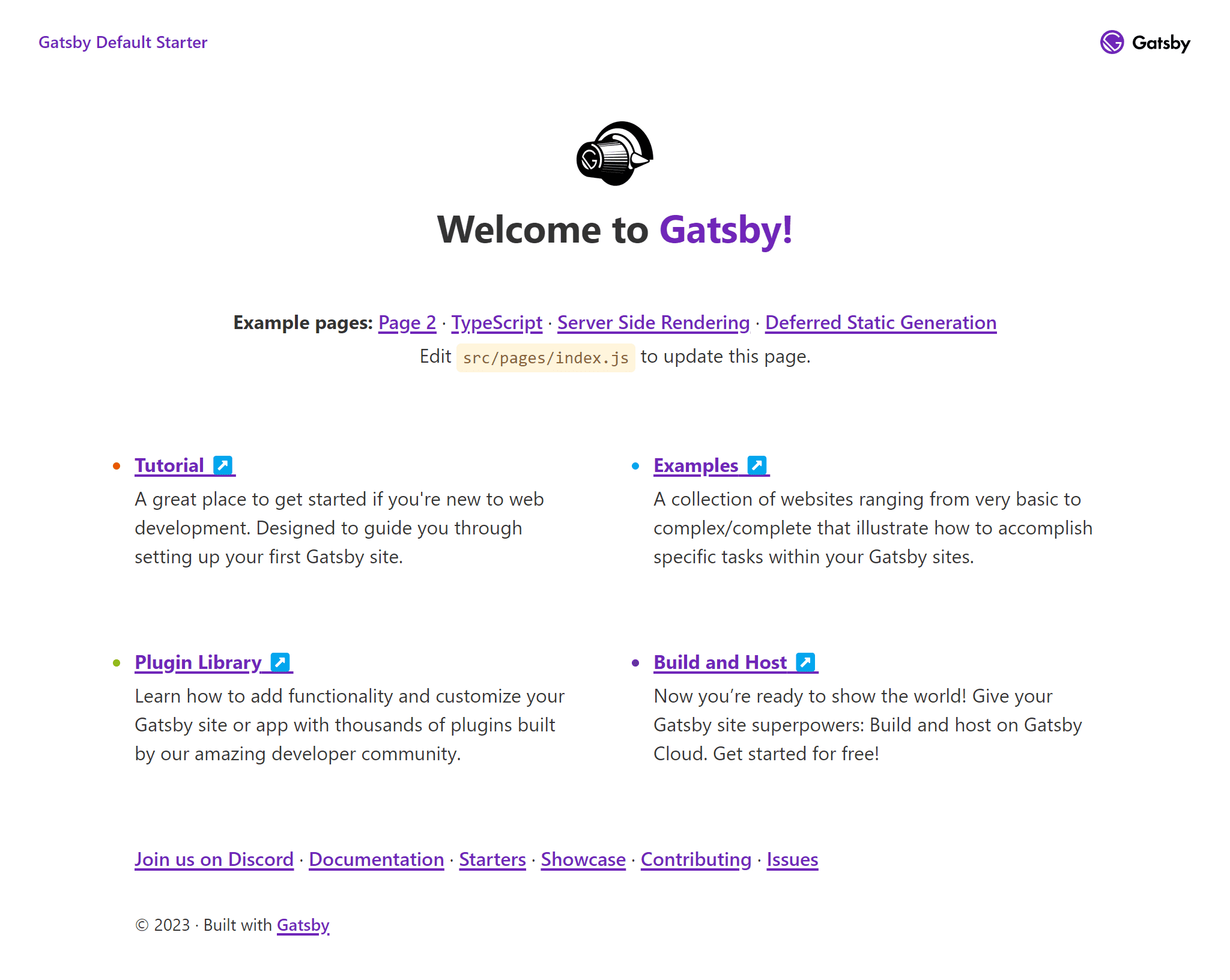
If all goes well then opening up localhost:8000 in a browser will show the below.

Styling with Tailwind CSS
For styling, I went with Tailwind CSS. I’ve found it to be a great framework when you want to build something highly customised and are using something like React that is component based.
To install and initialise Tailwind, we just run the following commands.
npm install tailwindcss postcss autoprefixer gatsby-plugin-postcss
npx tailwindcss init -p
For this project, I also installed two plugins for Tailwind. The typography plugin provides styling support and some sensible defaults for generated HTML content, such as the content in a blog post. The aspect ratio plugin provides an alternative for the native CSS aspect ratio for older browsers, and is used here in readiness for future updates when we look at supporting posts that include photo galleries.
npm install @tailwindcss/typography
npm install @tailwindcss/aspect-ratio
We enable the postcss plugin for Gatsby in the configuration.
// gatsby-config.js

module.exports = {
  plugins: [
    'gatsby-plugin-postcss',
  ],
};
Then update the Tailwind configuration file that was generated for us as part of the install. We add the relevant files/folders under content that Tailwind should look for when generating it’s styles, and enable any plugins we installed.
// tailwind.config.js

module.exports = {
  content: [
    './src/pages/**/*.{js,jsx,ts,tsx}',
    './src/components/**/*.{js,jsx,ts,tsx}',
		'./src/templates/**/*.{js,jsx,ts,tsx}',
  ],
  theme: {
    extend: {},
  },
  corePlugins: {
    aspectRatio: false,
  },
  plugins: [
    require('@tailwindcss/typography'),
    require('@tailwindcss/aspect-ratio'),
  ],
};
With that all set up, we can create a CSS file for our site containing the tailwind directives, and import the CSS into our Gatsby project.
/* src/styles/main.css */

@tailwind base;
@tailwind components;
@tailwind utilities;
// gatsby-browser.js
import './src/styles/main.css';From there, we can edit the homepage and create a simple initial layout with a header, main content section, and footer.
// src/pages/index.js

import React from 'react';

import Layout from '../components/layouts/Layout';

const IndexPage = () => (
  <Layout>
    <div>CONTENT</div>
  </Layout>
);

export default IndexPage;
// src\components\layouts\Layout.js
import React from 'react';
const Layout = ({ children }) => (
<>
<header className="fixed top-0 z-10 w-full bg-indigo-800 shadow-md">
<nav className="flex h-16 w-full p-4 text-white">
<div>HEADER</div>
</nav>
</header>
<div className="flex h-full flex-col pt-16">
<main className="flex shrink-0 grow">
<div className="mx-auto flex w-full max-w-5xl grow flex-col p-6">
{children}
</div>
</main>
<footer className="flex shrink-0 grow-0 border-t border-zinc-200 bg-zinc-50 p-4">
<div>FOOTER</div>
</footer>
</div>
</>
);
export default Layout;With all that done, this is what the homepage and layout looks like.
